Establishing a Design System
HSE's first design system, initiated during a company-wide rebrand and built from scratch. Adopted across 8 product squads and 3 platforms. ~15% faster delivery. And the harder win: a team that stopped treating quality as someone else's problem.
Overview
I initiated and led the creation of HSE's first design system shortly after joining the company. Working alongside the external agency behind HSE's major rebrand, I contributed hands-on design work (typography, colour, spacing) before building the governance and adoption model that made the system last across web, iOS, and Android.
My direct contribution
Initiation, architecture & adoption strategy
- Identified and made the case for the system shortly after joining HSE, using the incoming company rebrand as the strategic moment to build proper design foundations
- Collaborated with the external branding agency that led HSE's rebrand to translate the new visual identity into a systematic, buildable design language
- Personally designed the token architecture: spacing scale, type scale, colour system, and elevation logic that worked across web and both mobile platforms
- Wrote the contribution rules and governance model, the part most teams skip and the part that determines whether a system stays alive past year one
- Ran the accessibility audit that became the baseline for component standards
Team & collaboration
Stakeholder buy-in & org adoption
- Aligned engineering leads on technical implementation; different stacks on web, iOS, and Android required separate component implementations from shared design tokens
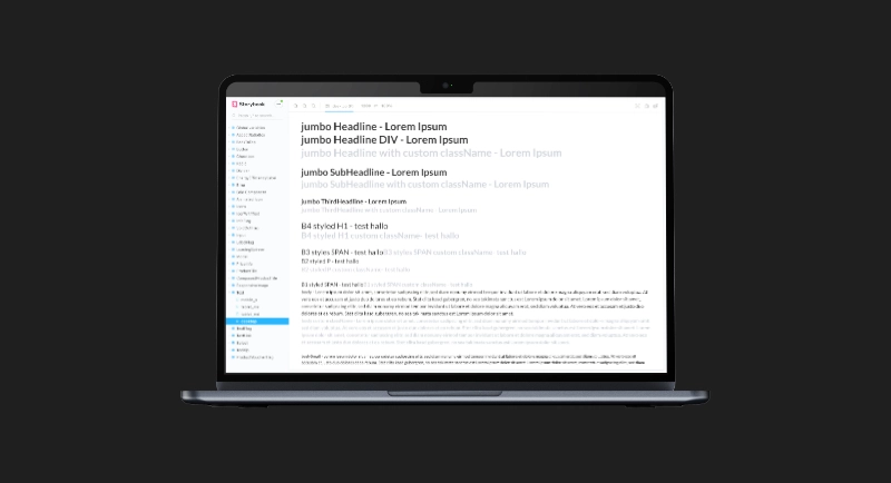
- Built the shared component library jointly with front-end engineers: designers defined states, behaviours, and tokens; engineers made the component-architecture decisions that determined what the system could actually scale to. The Storybook catalogue was the result of both sides designing, not one side specifying and the other executing
- Set up a review ritual so contributions went through design critique before entering the system
- Currently leading a major system review (2026), evaluating the system against current best practices: token machine-readability, documentation completeness, and design-to-code alignment
Duration: 2021 (major review ongoing, 2026) · Platforms: Web, iOS, Android · Squads: 8
Impact
- Accessibility standards built into components by default, not added at QA
The Problem
As the product expanded across web, iOS, and Android, and across 8 separate product squads, UI decisions diverged. Each team made reasonable local choices that added up to a global inconsistency problem. Components were rebuilt from scratch because nobody knew what already existed. Accessibility was patched in at QA because it wasn't built into components. Spacing and typography drifted because there were no shared tokens.
The symptom was inconsistency. The cause was the absence of a shared language.
The decision I got wrong first
My instinct was to lead with components. Build the shared library first, establish the Storybook catalogue with engineering, then write the governance rules. I had the sequencing backwards.
Governance determines whether a system survives the people who built it. When you write contribution rules after the culture has formed, you are fighting habits already in place. Who can propose a component, who approves it, what the acceptance criteria are: those decisions should be made before the first shared component is built, not after.
The consequence showed up over time. When key front-end contributors left the company, compliance weakened. Not because the components were wrong, but because the governance model had been built around people who cared about it rather than a structure that would outlast them.
The correction: two designers appointed as captains with real authority. They accepted or declined component proposals, monitored transgressions, and trained colleagues on the rules. A formal role is harder to vacate than an informal one.
What we built
- Design tokens: spacing scale, type scale, colour system, elevation, shared across web and mobile
- Reusable components with documented variants, states, and behaviours
- Accessibility standards built into components, not a post-hoc checklist
- Contribution rules and a review process so the system evolves without accumulating new debt
Reflection
The system I built in 2021 was correct for 2021. Design tokens were not machine-readable. Design-to-code alignment was manual. Neither was solved then; both are being addressed in the 2026 review. The lesson: governance documentation ages faster than components. The contribution rules I wrote are still largely valid. The token structure is not.
If I were starting the system today, I would build for machine-readability from the first decision, not retrofit it later. I would also invest in the documentation layer earlier, before teams form habits around the undocumented version.
The governance lesson, learned the hard way: formal ownership with real authority outlasts informal champions.
The other thing worth naming: the biggest gains from a design system are systemic and invisible. Fewer regressions caught late, faster decisions because the answer is already documented, fewer arguments about spacing because the token makes the decision. That is also why they are hard to sell. The value shows up in work that does not happen, not in work that does.
Takeaway
A design system only works if teams trust it. Building that trust, across 8 squads and 3 platforms, was harder than building the system. The governance model is the product.